Keylogg
Performance Debugging Pro
LEVEL 1
300 XP
In this tutorial, we will tackle about creating a simple Fullscreen Overlay Navigation Menu using only HTML and CSS. The tutorial's main purpose is to provide the students and beginners with a reference for understanding how to build a useful component of the website such as the Overlay Navigation Menu without using any Library or JS scripts. Here, I will be providing a simple web application's web page source code scripts to demonstrate the goal of this tutorial.
What is a Fullscreen Overlay Navigation Menu?
The Fullscreen Overlay Navigation Menu is a type of website or web application navigation menu design where the menu is shown in front of the whole page screen. It is commonly used for websites where most of the visitors are using mobile devices, tablets, or some other smaller screen devices. This navigation menu design commonly comes with a navigation menu button or menu button to show and hide it.
How can we create a Fullscreen Overlay Navigation Menu using HTML and CSS only?
Fullscreen Overlay Navigation Menu can be achieved even without using any other library or JS scripts. With the help of the HTML checkbox input, we can trigger the display and hide the functionality of the menu bar. Then we can simply create our desired design of the Overlay Navigation Menu using some CSS properties and pseudo-elements. Check out the sample web application scripts that I created and provided below to understand more about how to create a Fullscreen Overlay Navigation Menu using HTML and CSS.
Sample Web App Page
The script below is a simple web application page that contains a simple fullscreen overlaying navigation menu that can be triggered to show/hide by the floating menu button. The navigation menu and buttons also contain a simple transition.
Creating the Interface
The script below is the HTML file script of the web page which contains the elements that are relevant to this demonstration such as the static page content and the navigation menus.
Default Stylesheet
By default, we will be using the following CSS script as the design web page content.
The script above will output the following image
Designing the Navigation Menu
The following script is the CSS code for the design of the navigation menu's container/wrapper, list, and anchors. Using this, the navigation menu won't be visible yet on the page load.
If you wish to check the design of the overlay navigation menu, you can temporarily add the following CSS script and remove it after your customization or before continuing to the next step of this tutorial.
The script above will output the following image
Designing the Navigation Menu Button
Next, the script below is the CSS script for the design of the floating navigation button and hides the checkbox that will be used for triggering the menu to show/hide.
The script above will output the following image

Creating the Menu Show/Hide Functionality
Finally, the following script is used for making the floating menu button functional whereas it will display or hide the fullscreen overlay navigation menu.
The script above will output the following image

Overall, the script above will result in the following:
There you go! I have also provided the source code zip file of the web application that I created for this tutorial on this site. It is free to download. To download it, just click the download button located below this tutorial's content.
I hope this Creating a Fullscreen Overlay Menu Bar using HTML and CSS Tutorial will help you with what you are looking for and will be useful for your current and future web application projects.
Happy Coding =)
Download
What is a Fullscreen Overlay Navigation Menu?
The Fullscreen Overlay Navigation Menu is a type of website or web application navigation menu design where the menu is shown in front of the whole page screen. It is commonly used for websites where most of the visitors are using mobile devices, tablets, or some other smaller screen devices. This navigation menu design commonly comes with a navigation menu button or menu button to show and hide it.
How can we create a Fullscreen Overlay Navigation Menu using HTML and CSS only?
Fullscreen Overlay Navigation Menu can be achieved even without using any other library or JS scripts. With the help of the HTML checkbox input, we can trigger the display and hide the functionality of the menu bar. Then we can simply create our desired design of the Overlay Navigation Menu using some CSS properties and pseudo-elements. Check out the sample web application scripts that I created and provided below to understand more about how to create a Fullscreen Overlay Navigation Menu using HTML and CSS.
Sample Web App Page
The script below is a simple web application page that contains a simple fullscreen overlaying navigation menu that can be triggered to show/hide by the floating menu button. The navigation menu and buttons also contain a simple transition.
Creating the Interface
The script below is the HTML file script of the web page which contains the elements that are relevant to this demonstration such as the static page content and the navigation menus.
- <!DOCTYPE html>
- <html
lang
=
"en"
>
- <head
>
- <meta
charset
=
"UTF-8"
>
- <meta
http-equiv
=
"X-UA-Compatible"
content
=
"IE=edge"
>
- <meta
name
=
"viewport"
content
=
"width=device-width, initial-scale=1.0"
>
- <title
>
JS - Sortable List Items</
title
>
- <link
rel
=
"preconnect"
href
=
"https://fonts.googleapis.com"
>
- <link
rel
=
"preconnect"
href
=
"https://fonts.gstatic.com"
crossorigin>
- <link
rel
=
"stylesheet"
href
=
"https://fonts.googleapis.com/css2?family=Material+Symbols+Outlined:opsz,wght,FILL,[email protected],100..700,0..1,-50..200"
/
>
- <link
rel
=
"stylesheet"
href
=
"style.css"
>
- </
head
>
- <body
>
- <!-- Fullscreen Overlay Menu Bar Container -->
- <div
class
=
"ovelay-menu-container"
>
- <input
type
=
"checkbox"
id
=
"overlay-menu-check"
>
- <div
class
=
"overlay-menu-wrapper"
>
- <div
class
=
"overlay-menus"
>
- <ul
>
- <li
>
- <a
href
=
"#"
>
Home</
a
>
- </
li
>
- <li
>
- <a
href
=
"#"
>
Pricing</
a
>
- </
li
>
- <li
>
- <a
href
=
"#"
>
Gallery</
a
>
- </
li
>
- <li
>
- <a
href
=
"#"
>
About Us</
a
>
- </
li
>
- <li
>
- <a
href
=
"#"
>
Contact Us</
a
>
- </
li
>
- </
ul
>
- </
div
>
- </
div
>
- <div
class
=
"overlay-menu-btn"
>
- <label
for
=
"overlay-menu-check"
>
- <span
class
=
"material-symbols-outlined show"
>
menu</
span
>
- <span
class
=
"material-symbols-outlined close"
>
close</
span
>
- </
label
>
- </
div
>
- </
div
>
- <!-- End of Fullscreen Overlay Menu Bar Container -->
- <main>
- <section
>
- <h1
class
=
"text-center page-title"
><b
>
Click the Floating Navigation Menu Button to Open the Fullscreen Overlay Navigation Menu Bar</
b
></
h1
>
- </
section
>
- </
main>
- </
body
>
- </
html
>
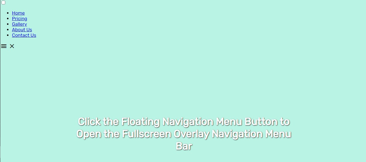
Default Stylesheet
By default, we will be using the following CSS script as the design web page content.
- @import
url
(
'https://fonts.googleapis.com/css2?family=Rubik&display=swap'
)
;
- body *
{
- font-family
:
'Rubik'
,
sans-serif
;
- }
- /**
- Page Design
- */
- body,
- html{
- height
:
100%
;
- width
:
100%
;
- margin
:
0
;
- padding
:
0
;
- }
- body{
- background-color
:
#B9F3E4
;
- }
- main{
- height
:
100%
;
- width
:
100%
;
- display
:
flex;
- flex-direction
:
column;
- justify-content
:
center
;
- align-items
:
center
;
- }
- section{
- width
:
760px
;
- margin
:
auto
;
- padding
:
1em
2em
;
- text-align
:
center
;
- }
- @media
(
max-width
:
760px
)
{
- section{
- width
:
100%
;
- }
- }
- .page-title{
- color
:
#fff
;
- text-shadow
:
1px
1px
3px
#000
;
- font-size
:
35px
;
- }
The script above will output the following image
Designing the Navigation Menu
The following script is the CSS code for the design of the navigation menu's container/wrapper, list, and anchors. Using this, the navigation menu won't be visible yet on the page load.
- /**
- Overlay Menu Style
- **/
- .overlay-menu-wrapper{
- position
:
fixed
;
- top
:
50px
;
- left
:
0
;
- width
:
0
;
- height
:
0
;
- background
:
#000000da
;
- display
:
flex;
- align-items
:
center
;
- justify-content
:
center
;
- flex-direction
:
column;
- overflow
:
hidden
;
- transition
:
height .3s
ease-in-out,
width .3s
ease-in-out,
top
.3s
ease-in-out;
- }
- .overlay-menus{
- width
:
300px
;
- transform
:
scale
(
0
)
;
- transition
:
transform .3s
ease-in-out .3s
;
- }
- .overlay-menus
ul{
- display
:
flex;
- width
:
100%
;
- padding
:
.5em
1em
;
- flex-direction
:
column;
- align-items
:
center
;
- }
- .overlay-menus
ul>
li{
- width
:
100%
;
- list-style
:
none
;
- text-align
:
center
;
- padding
:
.5em
1em
;
- }
- .overlay-menus
ul>
li>
a{
- text-decoration
:
none
;
- font-size
:
25px
;
- color
:
#fff
;
- font-weight
:
600
;
- }
- .overlay-menus
ul>
li,
- .overlay-menus
ul>
li>
a{
- transition
:
all .2s
ease-in-out;
- }
- .overlay-menus
ul>
li:
hover
{
- transform
:
scale
(
1.5
)
;
- }
- .overlay-menus
ul>
li:
hover
a{
- color
:
#B9F3E4
;
- }
- @media
(
max-width
:
460px
)
{
- .overlay-menus{
- width
:
100%
;
- }
- }
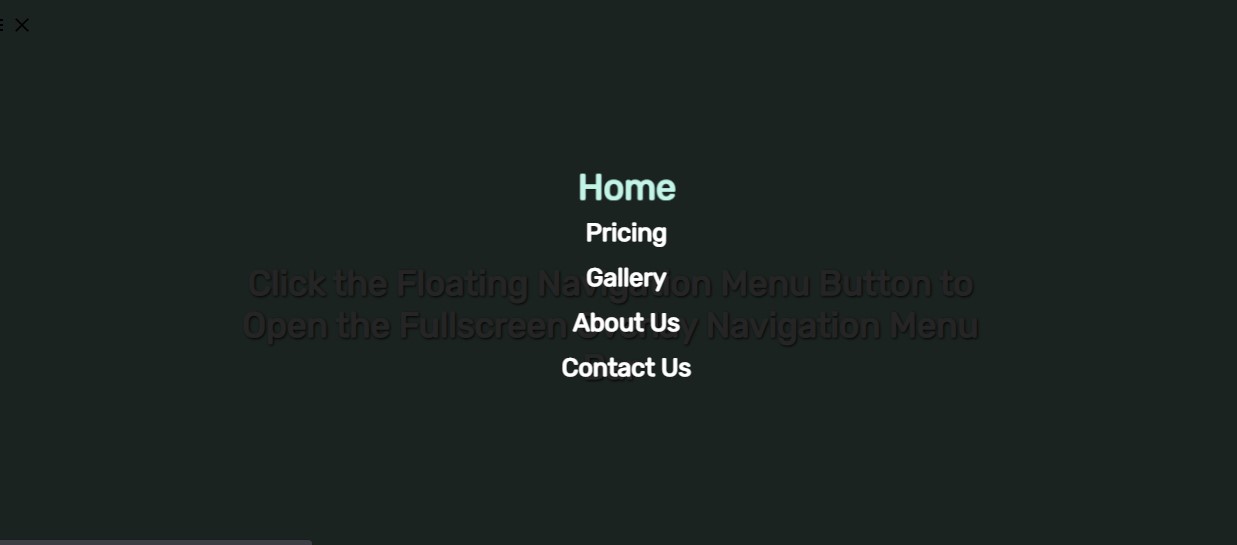
If you wish to check the design of the overlay navigation menu, you can temporarily add the following CSS script and remove it after your customization or before continuing to the next step of this tutorial.
- .overlay-menu-wrapper{
- top
:
0
;
- width
:
100%
;
- height
:
100%
;
- }
- .overlay-menus
{
- transform
:
scale
(
1
)
;
- }
The script above will output the following image
Designing the Navigation Menu Button
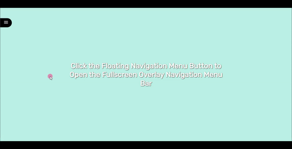
Next, the script below is the CSS script for the design of the floating navigation button and hides the checkbox that will be used for triggering the menu to show/hide.
- /**
- Overlay Menu Button Style
- **/
- .overlay-menu-btn{
- position
:
fixed
;
- top
:
50px
;
- left
:
0
;
- border-top-right-radius
:
50px
;
- border-bottom-right-radius
:
50px
;
- background-color
:
#000
;
- display
:
flex;
- justify-content
:
end
;
- padding
:
.5em
1em
;
- }
- .overlay-menu-btn>
label{
- color
:
#fff
;
- cursor
:
pointer
;
- width
:
100%
;
- transition
:
all .2s
ease ;
- }
- .overlay-menu-btn
:
hover>
label{
- padding
:
1em
.5em
;
- }
- input#overlay-menu-check
,
- .overlay-menu-btn>
label>
.close{
- display
:
none
;
- }
The script above will output the following image
Creating the Menu Show/Hide Functionality
Finally, the following script is used for making the floating menu button functional whereas it will display or hide the fullscreen overlay navigation menu.
- /*
- If Overlay Fullscreen menu is shown
- */
- input#overlay-menu-check
:
checked
~ .overlay-menu-wrapper{
- width
:
100%
;
- height
:
100%
;
- overflow-y
:
auto
;
- top
:
0
;
- }
- input#overlay-menu-check
:
checked
~ .overlay-menu-wrapper
.overlay-menus{
- transform
:
scale
(
1
)
;
- }
- input#overlay-menu-check
:
checked
~ .overlay-menu-btn{
- background-color
:
#fff
;
- }
- input#overlay-menu-check
:
checked
~ .overlay-menu-btn>
label{
- color
:
#000
;
- }
- input#overlay-menu-check
:
checked
~ .overlay-menu-btn>
label>
span.material-symbols-outlined{
- content
:
'close'
;
- }
- input#overlay-menu-check
:
checked
~ .overlay-menu-btn>
label>
.show{
- display
:
none
;
- }
- input#overlay-menu-check
:
checked
~ .overlay-menu-btn>
label>
.close{
- display
:
block
;
- }
The script above will output the following image
Overall, the script above will result in the following:
There you go! I have also provided the source code zip file of the web application that I created for this tutorial on this site. It is free to download. To download it, just click the download button located below this tutorial's content.
I hope this Creating a Fullscreen Overlay Menu Bar using HTML and CSS Tutorial will help you with what you are looking for and will be useful for your current and future web application projects.
Happy Coding =)
Download
You must upgrade your account or reply in the thread to view the hidden content.